We all know how important it is for websites to look great on phones and tablets. Mobile responsive WordPress themes help make sure that happens. When we choose a theme that adjusts to different screen sizes, our visitors have a better experience. Imagine trying to read a book with tiny letters; it’s frustrating, right? That’s why having a responsive design is like having a comfy chair for reading. According to Add A Little Digital, 70% of web traffic now comes from mobile devices. With mobile responsive WordPress themes, we can keep our audience happy and engaged. Let’s dive into how these themes can make our websites shine on any device.
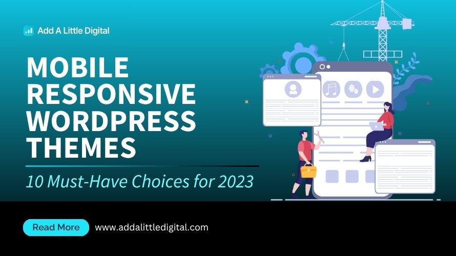
Overview Of Mobile Responsive WordPress Themes
Mobile responsive WordPress themes adapt to various screen sizes, providing a consistent user experience across devices. With more than 70% of web traffic originating from mobile devices, using mobile responsive WordPress themes becomes crucial for engaging visitors effectively.
Definition And Importance
Mobile responsive WordPress themes are designs that automatically adjust elements based on screen size, offering a hassle-free browsing experience on phones, tablets, or desktops. These themes play an essential role in improving user engagement and reducing bounce rates, leading to higher conversion rates. In the absence of mobile responsiveness, users face difficulty navigating, resulting in frustration and potential loss of business. Optimizing for mobile use promotes accessibility and ensures that content displays accurately. Mobile responsive WordPress themes also positively influence SEO rankings, as search engines favor mobile-friendly sites. Businesses seeking to expand their digital presence must consider mobile responsiveness as a key factor in their web strategy, ensuring they cater to the preferences of an increasingly mobile-savvy audience.
Key Features To Look For
When selecting mobile responsive WordPress themes, several key features enhance usability and performance. We should prioritize suitable layout options that rearrange content intelligently based on device type. Look for fast loading times, as speed affects user satisfaction and search engine optimization. Ensure compatibility with popular plugins to extend website functionalities seamlessly. Additional features include customizable headers and footers, enabling brand identity through various devices. Check for integrated social media options to encourage sharing, fostering community engagement. Support for high-quality images is vital, as visuals aid in attracting and retaining visitors. Regular updates are crucial, ensuring themes stay current with technological advancements. Finally, seek themes with strong customer support to assist with any issues that may arise post-implementation.
For further reading on the significance of responsive design in user experience, we recommend exploring other WordPress resources and checking out responsive web design principles for a broader understanding.
Top Mobile Responsive WordPress Themes
Choosing the right mobile responsive WordPress themes matters as more users access websites on mobile devices. A responsive design keeps users engaged, ensuring a positive experience across devices.
Theme 1: Astra
Astra stands out in mobile responsive WordPress themes for its lightweight design. Astra features a variety of pre-built templates that cater to different industries. It benefits from customization options, allowing us to create a truly unique look. Fast loading times help reduce bounce rates significantly. This theme is compatible with popular page builders like Elementor, making design easy and intuitive. Astra supports WooCommerce integration, facilitating e-commerce setups on mobile. Regular updates ensure that we receive the latest improvements and security enhancements.
Theme 2: OceanWP
OceanWP excels among mobile responsive WordPress themes, known for its flexibility and functionality. This theme offers multiple demos that fit various niches, making it easy for us to find a suitable design. OceanWP includes seamless integration with Elementor, ensuring responsive layouts. Customization options allow for header and footer adjustments. It supports responsive images, maintaining high-quality visuals on any device. This theme features built-in SEO optimization to help attract traffic. Frequent updates ensure ongoing support and enhancements for our websites.
Theme 3: GeneratePress
GeneratePress ranks high among mobile responsive WordPress themes due to its performance-oriented design. It features a modular structure, allowing us to disable functions that we don’t use. GeneratePress is lightweight, ensuring quick load times which benefit user experience. This theme is fully compatible with major page builders, providing excellent design opportunities. GeneratePress includes accessibility features, making it user-friendly for all visitors. Regular updates contribute to enhanced site security and new features over time. This theme encourages user engagement by emphasizing mobile usability.
Theme 4: Divi
Divi is a highly regarded mobile responsive WordPress theme with a visual builder. It offers advanced customization options through the drag-and-drop interface. Divi’s responsive editing capabilities allow us to see changes in real-time across devices. This theme provides pre-made layouts suitable for various business needs. Divi supports global elements, making site-wide changes easy. Regular updates and community support enhance our experience with the theme. It integrates smoothly with WooCommerce, simplifying online store setups.
Theme 5: Neve
Neve is a lightweight mobile responsive WordPress theme compatible with various site builders. It’s designed for speed and performance across mobile devices. Neve offers a selection of starter sites to jumpstart our projects. This theme includes flexible header layouts, allowing for tailored presentations. Neve supports WooCommerce and makes e-commerce straightforward. Regular performance checks ensure optimal functionality. Its mobile-friendly designs keep user engagement high.
Theme 6: Hestia
Hestia brings a modern look as a mobile responsive WordPress theme with a clean design. This theme provides various ready-to-use demos focused on business needs. Hestia supports compatibility with popular plugins for additional functionality. The theme is fully responsive, maintaining a stunning appearance on all devices. Hestia includes a live customizer to tweak layouts easily. Regular updates allow for improved features and enhanced performance. This theme focuses on SEO, contributing to better search engine visibility.
Theme 7: Salient
Salient offers visually striking mobile responsive WordPress themes with rich media features. It includes an extensive library of demos showcasing various industries. Salient’s responsive design ensures users experience excellent visuals on all devices. The theme supports video backgrounds, making pages more engaging. Salient includes integrated SEO features to help boost site visibility. Regular updates add fresh features and improve overall performance. Customer support enhances our experience with the theme.
Theme 8: Schema
Schema specializes in lightweight mobile responsive WordPress themes focused on speed. This theme enhances user experience through simple yet aesthetic designs. Schema’s integration with rich snippets can improve search engine ranking. It features mobile-friendly layouts that maintain quality across devices. Regular updates ensure it stays current with best practices. Schema benefits from built-in SEO options to attract more visitors. This theme encourages us to create responsive, user-focused websites.
For further exploration, check out best responsive themes and theme performance comparison.
Advantages Of Using Mobile Responsive Themes
As business owners, we often seek clarity on various subjects that impact our operations. Understanding these topics helps guide our decisions and strategies. Here are some essential informational topics that address common questions and needs.
- Understanding SEO Basics
We need to grasp the fundamentals of search engine optimization (SEO). Knowing how SEO works improves our website visibility and attracts organic traffic. Most customers search online before making a purchase, so being found is critical.
- Content Marketing Strategies
We can benefit from adopting effective content marketing strategies. Creating valuable content drives engagement and builds credibility. High-quality blog posts, videos, and infographics make our brand more relatable.
- Effective Social Media Use
We ought to understand the best practices for social media use. Engaging with customers on platforms like Facebook and Instagram can foster relationships. Knowing how to create targeted ads improves visibility and encourages user interaction.
- Email Marketing Techniques
We recognize the importance of effective email marketing. Personalized campaigns nurture leads and convert them into customers. Using automation tools helps us reach our audience at the right time with relevant messages.
- Website Design Principles
We must focus on website design principles that enhance user experience. An intuitive layout with easy navigation keeps visitors engaged. Ensuring our website is mobile responsive caters to the growing number of mobile users.
- Local SEO Importance
We can’t overlook the significance of local SEO. Optimizing for local searches connects us with nearby customers. This can increase foot traffic to our physical locations and drive local sales.
- Understanding Analytics
We should prioritize learning about website analytics. Analyzing traffic patterns reveals customer behaviors and preferences. This information allows us to make data-driven decisions that can influence future strategies.
- Essential Business Tools
We need to identify essential business tools that enhance productivity. Tools for project management, communication, and accounting streamline our operations. Embracing technology can save time and reduce errors.
- Building a Brand Identity
We aim to build a compelling brand identity. Consistent messaging and visuals set us apart in the crowded market. Engaging storytelling connects with customers on an emotional level.
- Effective Customer Service
We understand the value of effective customer service. Happy customers are more likely to return and recommend us to others. Prioritizing customer feedback helps us continually improve our offerings.
For more information on effective strategies in digital marketing, we recommend checking out the resources from social media marketing and email automation techniques. These articles provide insights that can support our efforts in growing our business.
Tips For Choosing The Right Theme
Selecting the right mobile responsive WordPress theme proves crucial for meeting business needs and optimizing user experience. We should focus on certain key aspects that influence our choice.
Assessing Your Needs
- Identify the Purpose: Determine what type of website we want to create, such as a blog, e-commerce site, or portfolio. Each type demands different functionalities in a mobile responsive WordPress theme.
- Evaluate Design Preferences: Choose themes that match our aesthetic preferences, ensuring visual appeal aligns with our brand identity. Customization options are essential.
- Consider Target Audience: Understand the needs of our target audience as their preferences dictate features we need in a mobile responsive WordPress theme.
- Review Compatibility Requirements: Check compatibility with essential plugins and tools that we plan to use. Certain functionalities require specific themes to work effectively.
- Examine Performance Metrics: Prioritize mobile responsive WordPress themes with high performance scores. Fast loading times reduce bounce rates and improve user satisfaction.
- Scrutinize Mobile Features: Look for themes that offer distinct mobile features, such as touch-friendly elements and streamlined navigation. These enhance usability on mobile devices.
- Ensure SEO Friendliness: Select mobile responsive WordPress themes that incorporate SEO best practices. Themes designed for SEO help elevate our site’s visibility in search engines.
- Look for Regular Updates: Opt for themes that provide frequent updates. Regular maintenance ensures compatibility with the latest WordPress version and security protocols.
- Analyze Customer Support: Reliable customer support matters when issues arise. We need themes backed by helpful support teams to resolve potential challenges.
Testing Responsiveness
We should test the responsiveness of a mobile responsive WordPress theme before finalizing our choice. Utilizing several devices can provide insight into the theme’s functionality.
- Use Online Tools: Leverage responsive design testing websites to analyze how the theme appears across various screen sizes. This offers an initial view of the mobile experience.
- Test on Multiple Devices: Physically check the theme on smartphones and tablets. Observing how it interacts across different devices allows us to gauge performance directly.
- Check Loading Speed: Monitor site speed using tools like Google PageSpeed Insights when viewed on mobile devices. Speed impacts user experience and retention.
- Interact with Elements: Click buttons, fill forms, and navigate pages on mobile to assess how user-friendly the theme proves. Engaging with the site provides valuable feedback on usability.
- Review the Layout: Ensure that all content displays correctly without misalignment or overflow issues. Proper formatting guarantees a seamless browsing experience.
- Analyze Font Readability: Confirm that fonts remain legible across devices. Readability influences our audience’s engagement with content.
- Verify Image Responsiveness: Ensure images adjust correctly for different screen sizes. Unresponsive images can detract from the overall appearance and affect load times.
- Seek Feedback: Inviting users to test the theme can yield insights into their experiences and preferences. Feedback helps identify potential improvements we may overlook.
- Consider Future Updates: Inspect the theme’s ability to adjust with upcoming devices and screen sizes. A forward-compatible theme will save us from future redesign challenges.
By focusing on these core areas when choosing mobile responsive WordPress themes, we can align our selection with business goals while enhancing user experience. For more resources on responsive design, visit mobile-friendly strategies or website performance tips.
Key Takeaways
- Importance of Mobile Responsiveness: Mobile responsive WordPress themes are essential for providing a seamless user experience across devices, especially as over 70% of web traffic comes from mobile devices.
- Key Features: Look for themes that offer fast loading times, compatibility with popular plugins, customizable layouts, and high-quality image support to enhance usability and engagement.
- SEO Benefits: Responsive themes improve SEO rankings by ensuring websites are mobile-friendly, which helps attract more visitors and reduce bounce rates.
- Top Theme Recommendations: Themes like Astra, OceanWP, GeneratePress, and Divi stand out for their flexibility, speed, and customization options, making them ideal choices for various website needs.
- Choosing the Right Theme: Assess your website’s purpose, design preferences, and audience needs, while prioritizing performance, SEO, and regular updates when selecting a mobile responsive theme.
- Testing Responsiveness: Always test themes on multiple devices and check loading speed, layout alignment, and image responsiveness to ensure optimal performance across all platforms.
Conclusion
Choosing a mobile responsive WordPress theme is vital for our online success. It not only enhances user experience but also helps us stay competitive in a mobile-driven world. By focusing on key features and ensuring compatibility with our business needs, we can create an engaging platform that resonates with our audience.
As we move forward, let’s remember that a well-optimized website is more than just aesthetics; it’s about providing value and convenience to our visitors. With the right theme in place, we’re better positioned to improve our SEO rankings, reduce bounce rates, and ultimately drive conversions. Embracing mobile responsiveness is a step towards building a stronger digital presence that meets the evolving demands of our users.
Frequently Asked Questions
What is a mobile responsive WordPress theme?
A mobile responsive WordPress theme is designed to automatically adjust its layout and elements based on the screen size of the device being used. This ensures that websites look great and are user-friendly on smartphones, tablets, and desktops, providing a consistent experience across all devices.
Why are mobile responsive themes important?
Mobile responsive themes are crucial because about 70% of web traffic comes from mobile devices. They enhance user experience, reduce bounce rates, and improve SEO rankings, ultimately increasing engagement and conversion rates for websites.
What key features should I look for in a mobile responsive theme?
When selecting a mobile responsive WordPress theme, look for features like varied layout options, fast loading times, plugin compatibility, customizable headers/footers, social media integration, high-quality image support, regular updates, and good customer support.
How do mobile responsive themes affect SEO?
Mobile responsive themes positively impact SEO because search engines prioritize mobile-friendly sites in rankings. A responsive design also improves user engagement and reduces bounce rates, both of which are beneficial for SEO performance.
Can you recommend any top mobile responsive WordPress themes?
Yes! Some top mobile responsive WordPress themes include Astra, OceanWP, GeneratePress, Divi, Neve, Hestia, Salient, and Schema. These themes offer features like lightweight design, customization options, e-commerce support, and SEO optimization.
What should business owners consider when choosing a theme?
Business owners should assess their specific needs, design preferences, and target audience. It’s essential to review compatibility with necessary plugins, check performance metrics, and ensure the theme is SEO-friendly to support their online goals.
How can I test the responsiveness of my WordPress theme?
You can test a WordPress theme’s responsiveness by using various devices to check layout, font readability, and image responsiveness. Additionally, online tools like Google’s Mobile-Friendly Test can help assess how well your site performs on different screen sizes.
What role does website design play in user experience?
Good website design is vital for user experience as it influences how easily users can navigate the site. A well-designed site ensures that content is accessible, visually appealing, and engaging, which helps retain visitors and encourages interaction.
How can I improve my website’s loading speed?
Improve loading speed by optimizing images, using a content delivery network (CDN), minimizing code, and selecting a reliable hosting provider. Regularly updating themes and plugins can also enhance performance and speed.
Why is local SEO important for businesses?
Local SEO is important as it helps businesses connect with nearby customers actively searching for products or services. By optimizing for local search, businesses can attract more foot traffic and increase their visibility in local search results.
Leave a Reply